Calvary Chapel: Website Redesign & Information Architecture Overhaul
Calvary Chapel's website had critical usability issues - visitors couldn't find sermons or basic information, navigation was cluttered with redundant pages, and the site structure was confusing. Over two years, I conducted a comprehensive site audit, restructured the information architecture from 39 pages to 30, redesigned the navigation flow, and rebuilt the site within Subsplash's CMS constraints.
Role: Product and UX/UI designer
Software: Figma, Subsplash, Canva, Illustrator
The Problem
Calvary Chapel's website had severe usability issues - visitors couldn't find sermons, events, or basic information. The navigation was cluttered with duplicate pages, the information architecture was confusing, and the site hadn't been updated in years. My challenge: restructure the entire site within Subsplash's CMS constraints while also refreshing the visual brand.
Research & Discovery
Audit Findings
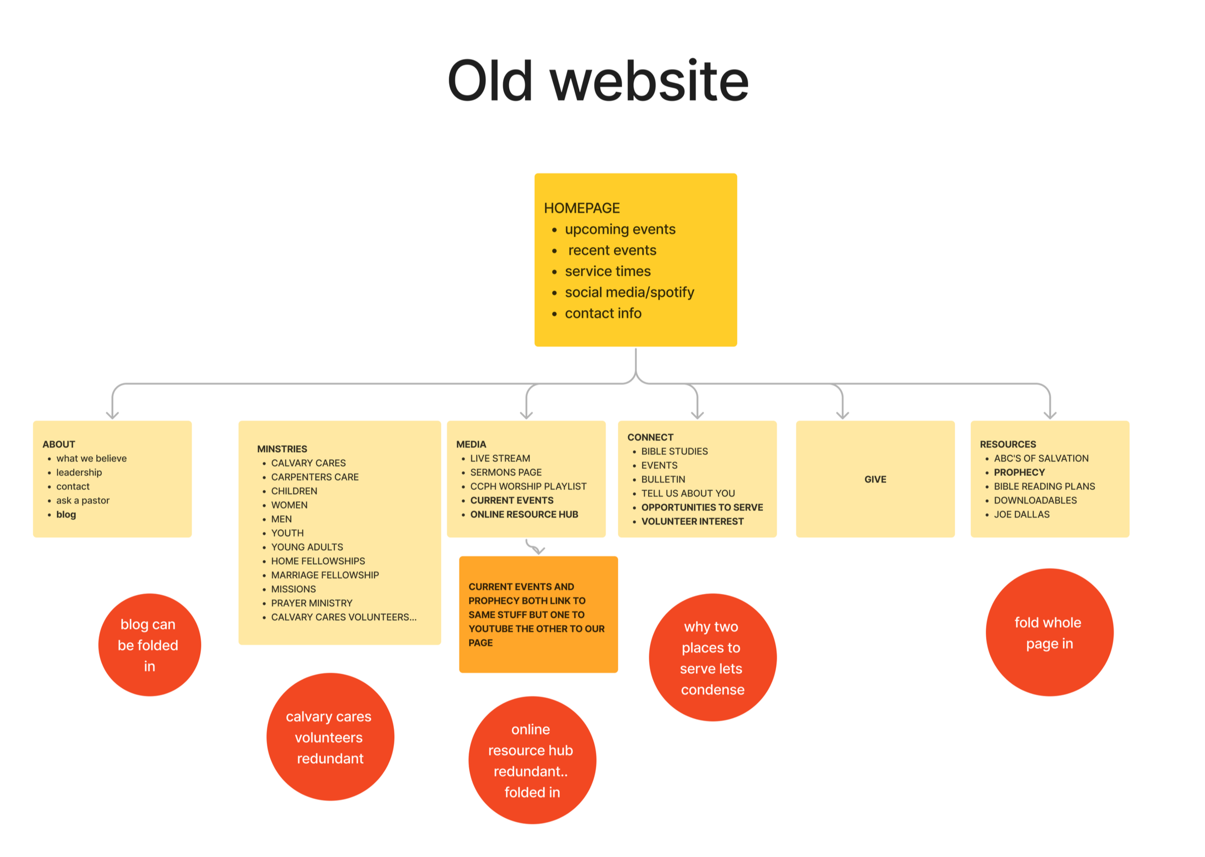
I conducted a comprehensive audit of the existing website, mapping all pages and documenting usability issues. The site had grown organically over years without strategic oversight, resulting in a fragmented user experience.
Key Problems Identified:
Navigation & Information Architecture
No clear path to sermons - the most-requested content was buried 3-4 clicks deep
10 redundant pages created confusion (multiple sign-up pages for the same ministries, duplicate event calendars)
An unclear site hierarchy made it difficult for users to find information
Content Management Issues
5 pages were abandoned and no longer maintained, including a blog that hadn't been updated in 2 years
Outdated information gave the impression that the church was inactive
No content strategy or clear ownership of page updates
User Impact
Visitors couldn't quickly find service times, sermon archives, or how to get involved
Staff received frequent "Where do I find...?" questions that indicated navigation failures
New visitors bounced without finding basic information
Competitive Analysis
I researched local churches and other Calvary Chapel locations to identify common patterns and user expectations
Key findings:
Most churches featured sermons prominently on the homepage or in the top navigation
Standard navigation patterns: About, Ministries, Events, Sermons, Contact, Baptism, and Prayer
Service times and location were consistently visible in headers or hero sections
Successful sites used 4-6 main navigation categories (our old site had 6 with confusing subcategories)
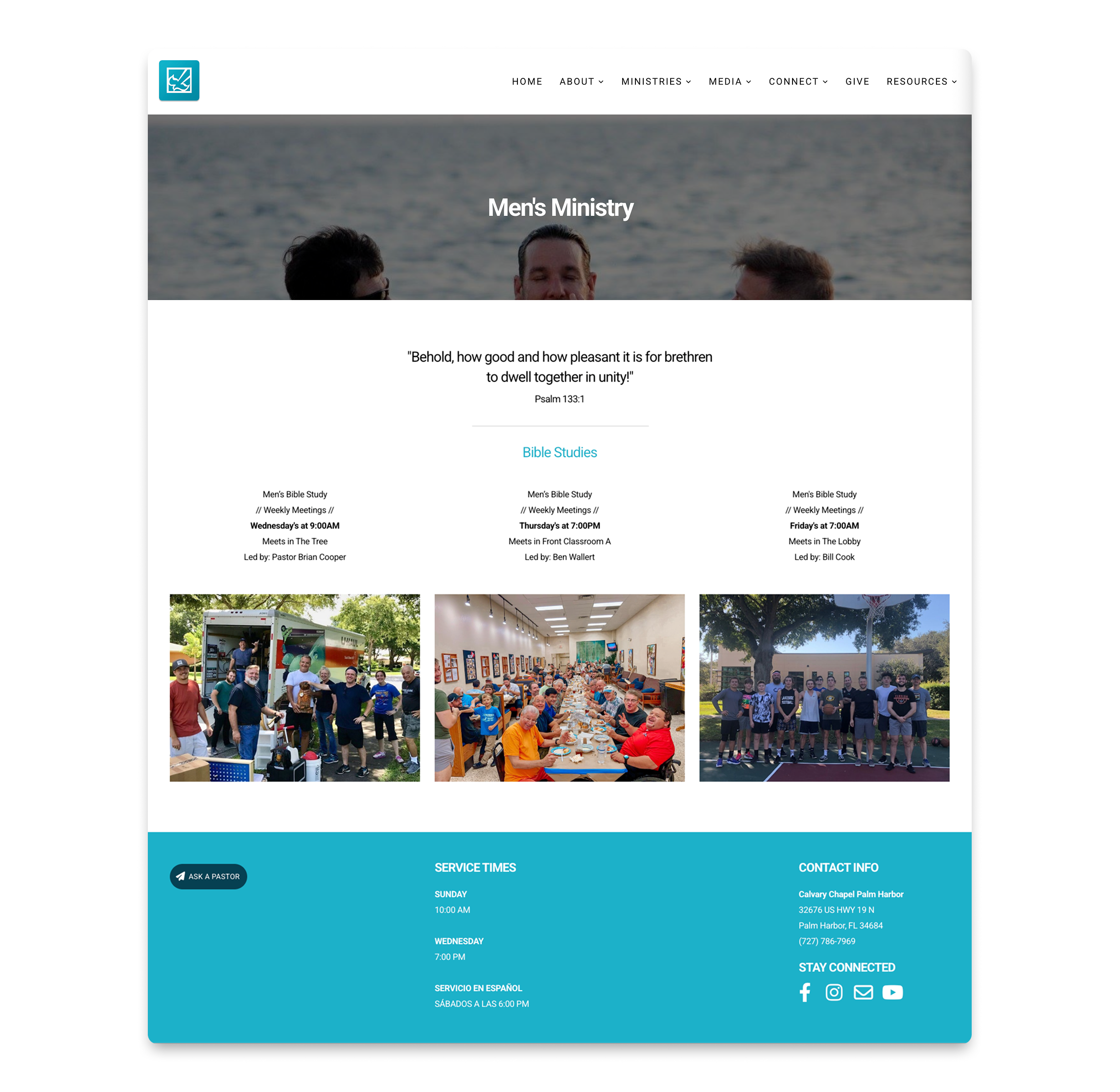
Ministry pages followed consistent templates for easy scanning
This research informed my navigation restructuring and page-hierarchy decisions.
Technical Constraints
The site was built on Subsplash CMS, which has limited customization options
Any solution needed to work within Subsplash's template system and component library
I used custom code, Canva, and Figma to bypass some of Subsplash's limitations.
I restructured the backend for easier maintenance by non-technical staff
Solutions
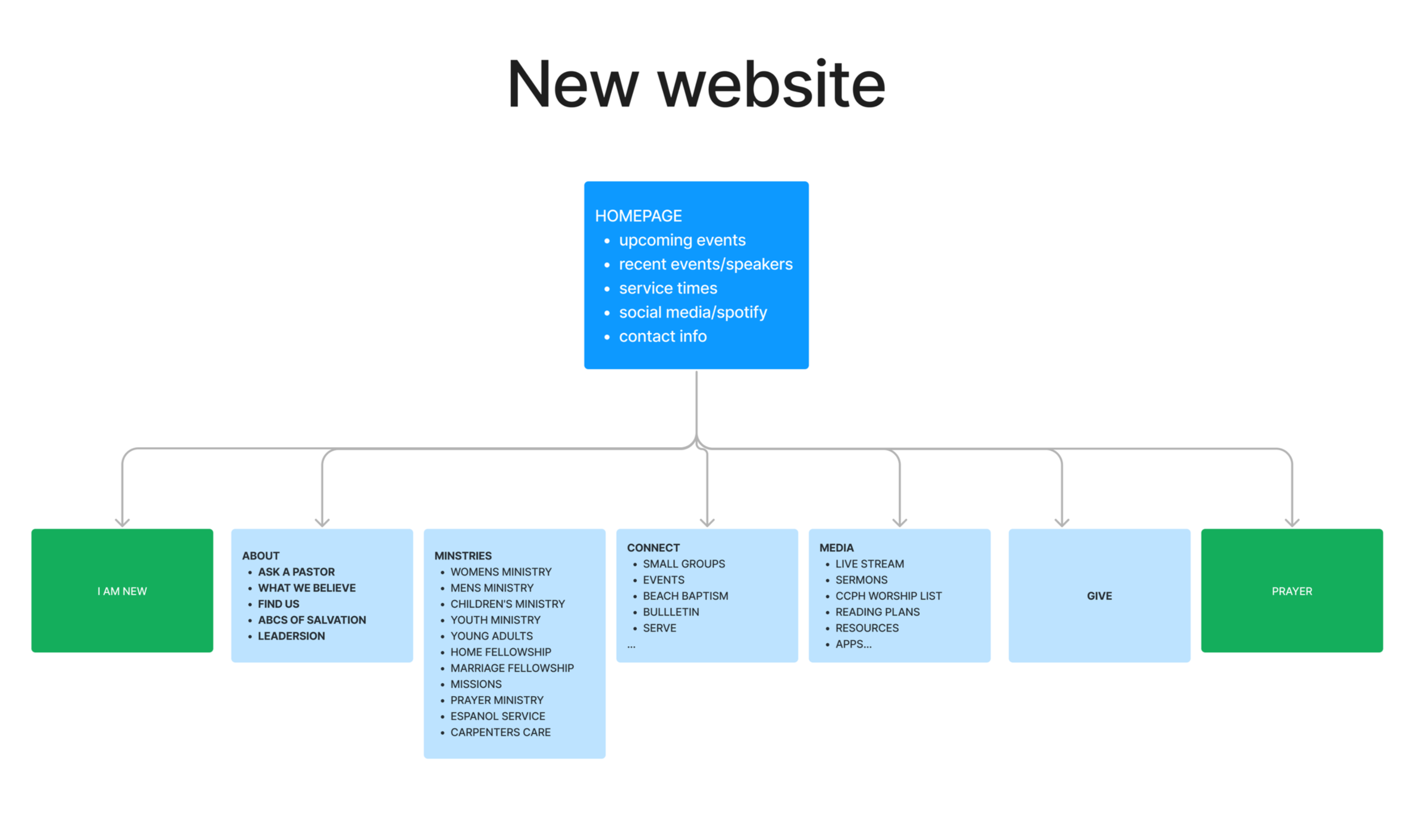
Information Architecture Overhaul
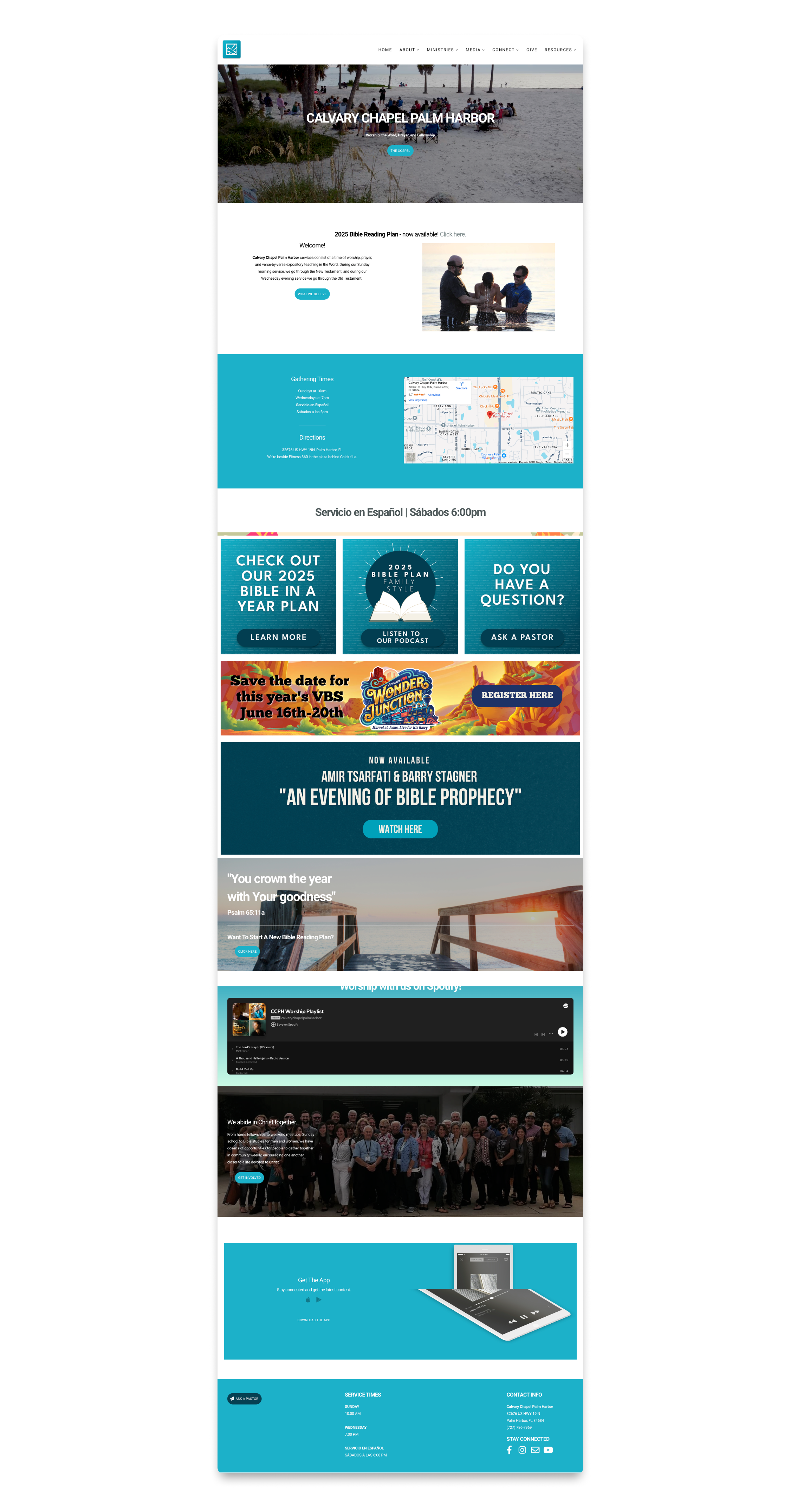
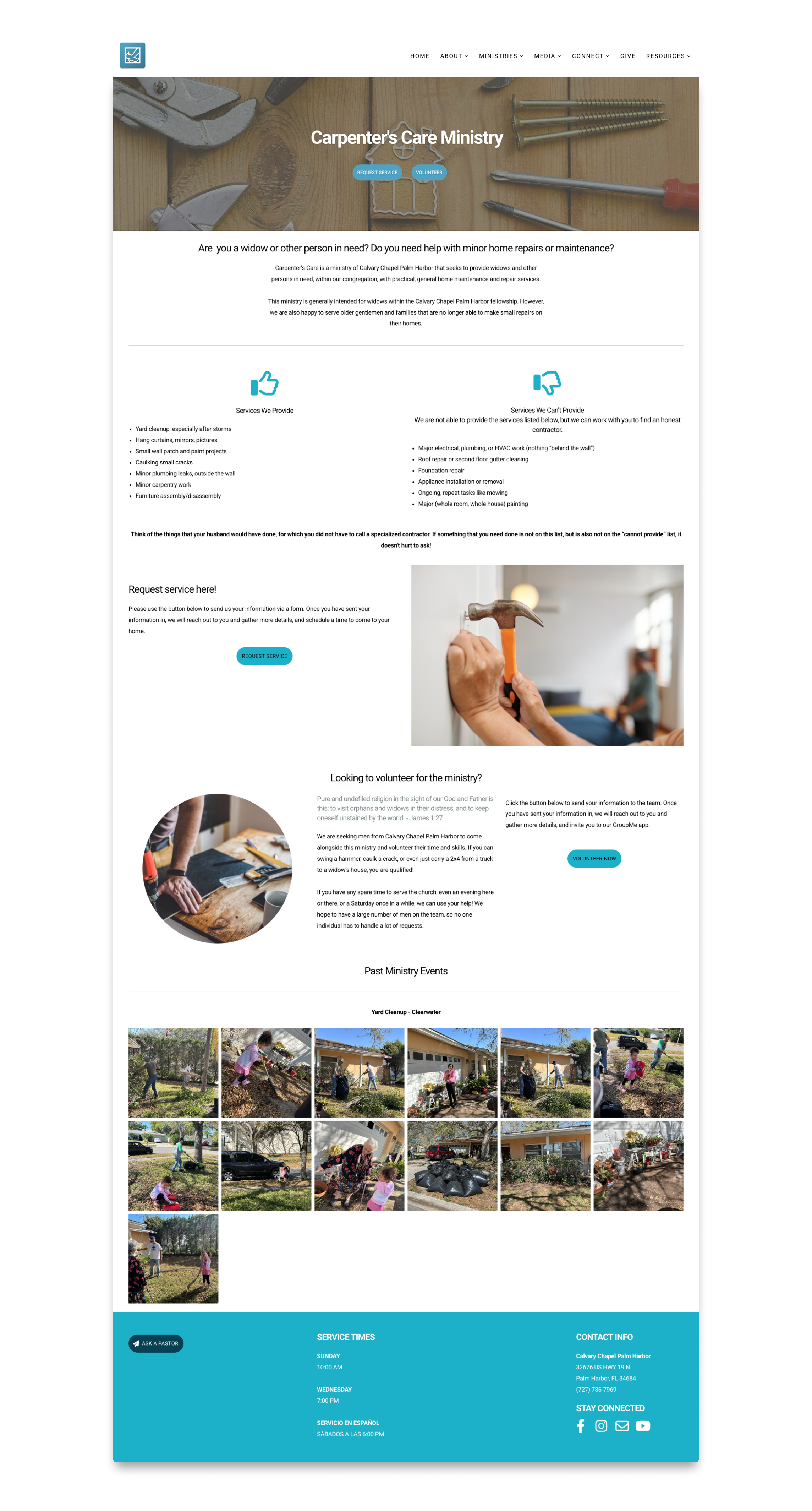
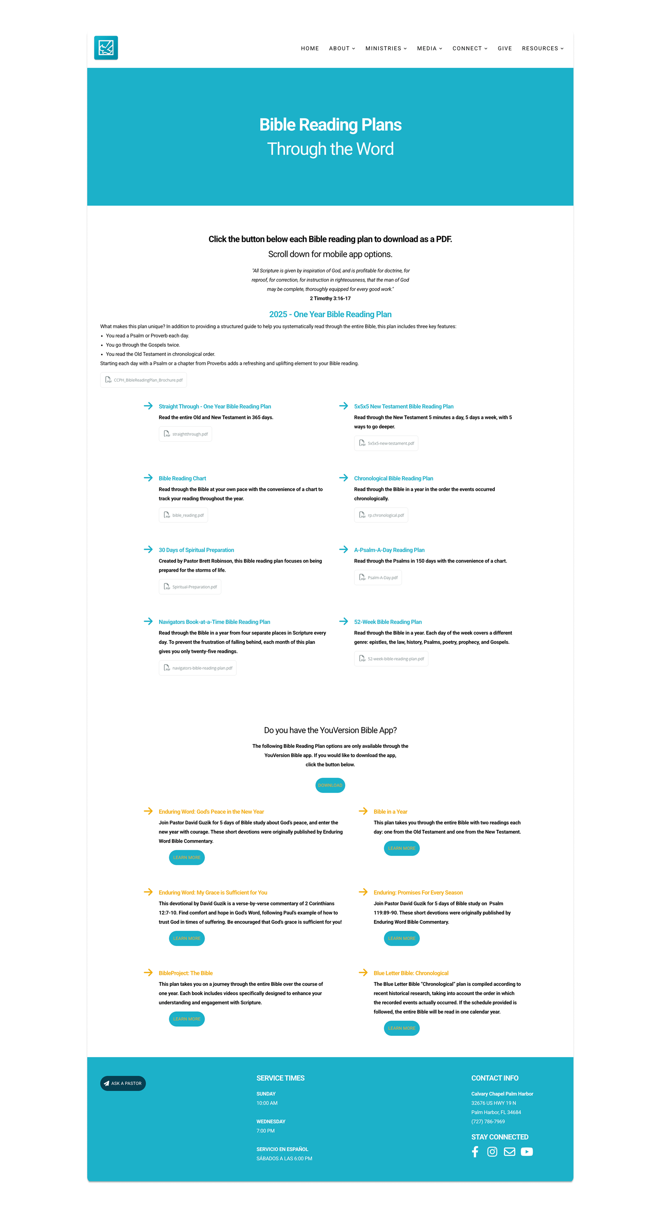
Streamlined the site from 39 pages to 30 by eliminating 10 redundant pages and removing 5 outdated ones. Reorganized navigation to prioritize visitor needs: elevated "I Am New" and "Prayer" to top-level, consolidated scattered volunteer pages into one "Serve" section.
Added Spanish-only pages to better serve the Saturday night Spanish service community.
Before/After:
Sermons: 4+ buried clicks → 2 clicks from homepage
Volunteer: 3 scattered pages → 1 clear "Serve" page
Service times: Hidden in footer → Prominently displayed on homepage (including Spanish service)
Working Within Subsplash
The CMS had strict limitations, so I learned the platform's component library and creatively leveraged existing templates.
Custom Code Solutions:
Added custom CSS for text blocks with background colors (not available in default templates)
Created a gradient footer design that wasn't possible with standard components
Currently implementing custom code for all forms to improve functionality and design consistency
Created documentation for non-technical staff to maintain the site while preserving custom enhancements.
Visual Design
Expanded the existing teal brand with warm sunset tones for approachability. Used authentic community photos instead of stock imagery. Ensured high contrast and larger text for all-ages readability.
Outcomes
Launched: Summer 2025
User Feedback:
Congregation members consistently reported that the site is "so much easier to navigate" and that they can actually find what they need
New visitors specifically commented to the pastoral staff that the site looks professional and modern
Increased engagement: People reached out about baptism directly through the improved site
Positive pastoral feedback on usability improvements
Operational Impact:
Staff reports fewer "Where do I find...?" questions
Non-technical team members can now maintain and update the site independently
Spanish-speaking community has dedicated resources for the first time
Final designs


Site Map
Inspiration


Initial wireframes

Old website